COVID-19 population dynamics

Our regular Ecology practical class for population dynamics measures the population growth rate of Paramecium under two different levels of food. The results typically show that population growth rates are higher in populations with more food. Despite some challenges (e.g., some students find it tricky to count ciliates under a microscope – you need to get the lighting right), I like this prac. We also examine pond samples, looking at other species in communities in which ciliates exist, and thinking about the types of interactions. We typically see some Hydra, which I regard as particularly groovy (and we once saw a Hydra eat a Daphnia).

This YouTube video gives the idea of what it looks like when a Hydra eats a Daphnia.

But with classes switching to be online, we decided to examine the population dynamics of COVID-19 infections instead this year. We started by simulating exponential growth, showing that the exponential growth rate can be estimated for a regression of loge(abundance) versus time.

Then we simulated dynamics under an SIR model, showing that the number people infected follows exponential dynamics (approximately) early and late in an epidemic (if infection and recovery parameters remain constant) when the number of susceptible individuals changes slowly.

We then shifted to examining the incidence of COVID-19 in nine US states, which showed that rates of infection clearly varied in response to control measures.

I finished off the class by showing how the number of new infections per day should also change exponentially over time if the dynamics were exponential. Given we are currently still in lockdown in Melbourne, we looked at how the rate of new cases was declining here. The reduction in cases clearly conforms closely to exponential dynamics – log-abundance versus time is a downward sloping line (see figure).

New cases per day in Victoria on a log scale (dots) with a 7-day moving average (thick line). The thin line is a linear projection, which would be followed if the dynamics were exponential dynamics. The close correspondence between this exponential projection and the 7-day average shows that dynamics were close to exponential until the start of October, when some outbreaks occurred. With the outbreaks seemingly now contained, we seem to be returning to the exponential projection.

The analysis also allows us to project the number of new cases into the future. At the time of the classes (23-25 September), we were tracking at a touch over 10 cases per day. I mentioned that we might depart from exponential as cases declined further – epidemics often have stubborn tails. In the parlance of distributions, these are known as “fat tails” – the decline is slower than exponential in the tails.

It turns out that we have seen a suggestion of fat tails with the various outbreaks that have occurred (Chadstone, Kilmore, Shepperton – all linked to a couple of people not following the rules…). But hopefully with those outbreaks controlled, the exponential projection of cases will remain roughly on track.

Two cases today – we are still seeing numbers decline in line with the exponential trend. Nice job Victoria!

Grad Seminar 2016

After getting preliminaries out of the way in the first class for Graduate Seminar: Environmental Science, today’s class discussed the process of publication and peer review. However, the discussion broadened into biases in science, including gender bias, and (very briefly) the issue around reproducibility in science (or the lack thereof).

Regarding gender bias in ecology, it is worth watching this video featuring Professors Emma Johnston and Mark Burgman. Emma Johnston also has a recent article in The Conversation.

ESA_GenderPlenary

Regarding reproducibility, read this, this, and this.

We also discussed topics that we want to cover in the class, things that we like about The University of Melbourne, and things we don’t like. We’ll post about those things shortly.

Data need to be normally-distributed, and other myths of linear regression

There are four basic assumptions of linear regression. These are:

  1. the mean of the data is a linear function of the explanatory variable(s)*;
  2. the residuals are normally distributed with mean of zero;
  3. the variance of the residuals is the same for all values of the explanatory variables; and
  4. the residuals should be independent of each other.

Let’s look at those assumptions in more detail.

1. Linearity

The linearity assumption is perhaps the easiest to consider, and seemingly the best understood. For each unit increase in the explanatory variable, the mean of the response variable increases by the same amount, regardless of the value of the explanatory variables.

LinearRegression_Linear

The mean of the response variable (the line, which is fitted to the data (the dots)) increases at the same rate, regardless of the value of the explanatory variable. This is the basis of the linearity assumption of linear regression.

2. Normality

Some users think (erroneously) that the normal distribution assumption of linear regression applies to their data. They might plot their response variable as a histogram and examine whether it differs from a normal distribution. Others assume that the explanatory variable must be normally-distributed. Neither is required. The normality assumption relates to the distributions of the residuals. This is assumed to be normally distributed, and the regression line is fitted to the data such that the mean of the residuals is zero.

What are the residuals, you ask? These are the values that measure departure of the data from the regression line.

LinearRegression_Residuals

The residuals are the differences between the data and the regression line (red bars in upper figure). The residuals deviate around a value of zero in linear regression (lower figure). It is these residuals that should be normally distributed.

To examine whether the residuals are normally distributed, we can compare them to what would be expected. This can be done in a variety of ways. We could inspect it by binning the values in classes and examining a histogram, or by constructing a kernel density plot – does it look like a normal distribution? We could construct QQ plots. Or we could calculate the skewness and kurtosis of the distribution to check whether the values are close to that expected of a normal distribution.

With only 10 data points, I won’t do those checks for this example data set. But my point is that we need to check normality of the residuals, not the raw data. You can see in the above example that both the explanatory and response variables are far from normally distributed – they are much closer to a uniform distribution (in fact the explanatory variable conforms exactly to a uniform distribution).

3. Equal variance

Linear regression assumes that the variance of the residuals is the same regardless of the value of the response or explanatory variables – the issue of homoscedasticity. If the variance of the residuals varies, they are said to be heteroscedastic. The residuals in our example are not obviously heteroscedastic. If they were, they might look more like this.

LinearRegression_Hetero

The residuals in this example are clearly heretoscedastic, violating one of the assumptions of linear regression; the data vary more widely around the regression line for larger values of the explanatory variable. In the previous example, the variation in the residuals was more similar across the range of the data.

4. Independence

The final assumption is that the residuals should be independent of each other. In particular, it is worth checking for serial correlation. Correlation is evident if the residuals have patterns where they remain positive or negative. In our first example, the residuals seem to randomly switch between positive and negative values – there are not disproportionately long runs of positive or negative values.

In contrast, if we examine the human population growth rate over the period 1965 to 2015, we see that there are extended time periods where the observed growth rate is above the fitted line, and then extended periods when it is below.

LinearRegression_AutoCorrelation

Human population growth rate over the period 1965 to 2015 is serially correlated – there are extended periods when the residuals are positive (data are above the trend line), and extended periods when they are negative (data are below the trend line).

A key in independence in linear regression is that the values of the response variables are not independent – in fact, there is an approximate linear change! Indeed, this is related to the first assumption that I listed, such that the value of the response variable for adjacent data points are similar. But the residuals must vary independently of each other.

So, those are the four basic assumptions of linear regression. If you don’t think your data conform to these assumptions, then it is possible to fit models that relax these assumptions, or at least make different assumptions. We can:

  1. fit non-linear models;
  2. assume distributions other than the normal for the residuals;
  3. model changes in the variance of the residuals;
  4. or model correlation in the residuals.

All these things, and more, are possible.


* To keep things simple, I will only discuss simple linear regression in which there is a single explanatory variable.

Vacation jobs with GHD

GHD are advertising for vacation jobs for “undergraduate students at the end of their third year” in the coming summer. I’d imagine that these positions would also be suitable for honours and Masters students who are interested in working in environmental consulting. Several students in the University of Melbourne’s masters programs have been offered vacation employment with GHD in previous years, and they have often then joined GHD via their graduate recruitment program. I understand that applications close on 31 August. For information from GHD, see here:

http://ghd.com.au/global/careers-1/students/

Nuclear energy for biodiversity conservation

We are going to kick off our subject Graduate Seminar: Environmental Science by discussing this recent paper by Barry Brook and Corey Bradshaw:

Key role for nuclear energy in global biodiversity conservation

Here is the abstract:

Modern society uses massive amounts of energy. Usage rises as population and affluence increase, and energy production and use often have an impact on biodiversity or natural areas. To avoid a business-as-usual dependence on coal, oil, and gas over the coming decades, society must map out a future energy mix that incorporates alternative sources. This exercise can lead to radically different opinions on what a sustainable energy portfolio might entail, so an objective assessment of the relative costs and benefits of different energy sources is required. We evaluated the land use, emissions, climate, and cost implications of 3 published but divergent storylines for future energy production, none of which was optimal for all environmental and economic indicators. Using multicriteria decision-making analysis, we ranked 7 major electricity-generation sources (coal, gas, nuclear, biomass, hydro, wind, and solar) based on costs and benefits and tested the sensitivity of the rankings to biases stemming from contrasting philosophical ideals. Irrespective of weightings, nuclear and wind energy had the highest benefit-to-cost ratio. Although the environmental movement has historically rejected the nuclear energy option, new-generation reactor technologies that fully recycle waste and incorporate passive safety systems might resolve their concerns and ought to be more widely understood. Because there is no perfect energy source however, conservation professionals ultimately need to take an evidence-based approach to consider carefully the integrated effects of energy mixes on biodiversity conservation. Trade-offs and compromises are inevitable and require advocating energy mixes that minimize net environmental damage. Society cannot afford to risk wholesale failure to address energy-related biodiversity impacts because of preconceived notions and ideals.

The full paper is here. Have any counter arguments to this piece been published? Do any such arguments exist? What is the evidence to support these counter arguments? I look forward to the discussion.

Environmental modelling has little to do with green fashion

Image from treehugger.com

A model in the environment. Rarely do people venture into forests attired like this. While unrealistic, the model is used for a purpose. Similarly, environmental models are unrealisitc, but designed that way for a reason (image from treehugger.com).

Environmental modelling has nothing to do with green fashion. Or perhaps it does, but only obliquely – fashion models are usually stylised versions of reality (think make-up, air brushing, clothing that might not befit the conditions, etc). Somewhat similarly, environmental models are also stylised versions of reality.

A model of the Vasa, a Swedish warship from the 1620s. (Image from www.modelships.de).

A model of the Vasa, a Swedish warship from the 1620s (image from www.modelships.de).

A conceptual model of the carbon cycle of an African savannah. Williams et al. Carbon Balance and Management 2007 2:3.

A conceptual model of the carbon cycle of an African savannah (from Williams et al. Carbon Balance and Management 2007 2:3).

DNA_orbit_animated

DNA does not look exactly like this, but the model helps to understand DNA’s structure. (GIF by Zephyris at the English language Wikipedia).

Environmental models, as with other models, have their own particular purpose. A model of a Swedish warship wouldn’t battle a real Polish fleet. DNA does not look exactly like its model, yet the model helps to understand and communicate its structure. A model of the carbon cycle of an African savannah can help understand the main components of the system and how they are linked, but it is not the real cycle.

Perhaps the most naive criticism of an environmental model is that it is unrealistic. Such a comment is naive because models are meant to be unrealistic. You might think that more realistic models are always better. If so, you would be wrong, because models are designed to be imperfect descriptions of reality.

Hanna Kokko makes this point that models should be somewhat unrealistic with an analogy to maps. Imagine you are lost in the forest. A map, a model of reality, would help find your way home. You don’t need a perfect model of reality. A perfect model of reality would be identical to reality itself, and you have more than enough reality staring you in the face. In fact, it is the reality, so complex and cumbersome, that obscures the way home. To navigate efficiently, you’d need a sufficiently simple model.

If you were lost in a forest, find your way home with a map that subscribes to Hanna Kokko's approach to modelling. If it were too detailed, it would look like the forest itself. If it were too superficial, you might be none the wiser about where you. A good would strike the appropriate balance between complexity and simplicity for the task (adapted from Hanna Kokko's book Modelling for Field Biologists)

If you were lost in a forest, find your way home with a map that subscribes to Hanna Kokko’s approach to modelling. If it were too detailed, it would look like the forest itself. If it were too superficial, you might be none the wiser about where you were in the world. A good map would strike the appropriate balance between complexity and simplicity for the task (adapted from Hanna Kokko’s book Modelling for Field Biologists)

However, the model must not be too simple. To paraphrase Einstein, models should be as simple as possible, but no simpler. That is the crux of modelling – a modeller must find the balance between complexity and simplicity for the task at hand.

Another reason we need environmental models is that we often cannot afford to experiment with environmental systems in case our experiments have unintended consequences. Let’s return to the Swedish warship, which is the Vasa. Built over two years for King Gustavus Adolphus, the king wanted an impressive vessel, packed with many guns. It launched in 1628 to great fanfare.

However, the balance between lots of heavy guns above the waterline, and a fast and manoeuvrable warship was delicate – a little too delicate as it turned out. Less than a mile from its dock and with a couple of puffs of breeze, the ship leaned over, submerging its lower gun ports. Filling with water, the Vasa promptly, and ignominiously, sank.

A model of the warship – a physical model in the time of the Vasa, or a mathematical model in the modern age – would have been sufficient to help assess the ship’s stability prior to it being built.

The Vasa in real life, salvaged from off the coast of Stockholm, and now housed in the Vasa Museum (image from the Vasa Museum).

Think of the ship as the world’s environment. Would we want to test different options on the real environment, or test those options on models? With only one Vasa, and with only one world, it might often be prudent to assess options with models first, before implementing them in reality.

Detectability

We’re looking at detectability this week in Environmental Monitoring & Audit. Here are some relevant links:

1. First, check out Guru and Jose’s video explaining why detectability is important in species distribution models (there’s also some bloopers).

2. Then we have Georgia’s post about setting minimum survey effort requirements to detect a species at a site.

3. Another by Georgia about her trait-based model of detection.

4. And finally, a paper showing that Georgia’s time to detection model can efficiently estimate detectability.

And if you want more about detectability, check out a few posts of mine.

Science Graduate Program – DEPI

A quick post – The Victorian Department of Environment and Primary Industries is accepting applications for its Science Graduate Program for 2015. Applications close 11 August, so getting cracking if you are interested in an environmental career with the Victorian government.


Some statistics to get started

The subject Environmental Monitoring and Audit starts today. We’ll be delving into some statistics, so my introductory chapter on statistical inference for an upcoming book might be useful.

And we’ll be using R, so if you need a quick introduction, check out Liz Martin’s blog.

Edit: And if you want some more information about double sampling (from Angus’ lecture today), please read this blog post.

The timing of cool changes in Melbourne

Melbourne – what a place to live! If you don’t like the weather, just wait a while and it will change. Positioned in the southeast of Australia, the most dramatic changes occur when summer north-westerly winds that channel over the country’s baking interior are replaced by south-westerlies coming roughly from Antarctica.

A typical headline in Melbourne after days of sweltering heat in summer.

A typical headline in Melbourne after days of sweltering heat in summer.

These cool changes can be dramatic. Temperatures can drop from around 40 °C to 25 °C in a matter of an hour. That’s a drop of 25-30 °F for those working in Fahrenheit. Maximums can be more than 20 °C different from one day to the next. Cool changes often arrive in Melbourne after many days of sweltering heat; you can almost hear the city of 4 million sigh.

Predicting the timing of summer cool changes is important for various reasons regarding public safety, including bushfire management. The winds before and after a cool change are often strong, so bushfires can be extremely intense at this time. The worst fire events in Victoria are typically associated with these wind changes. Fires that might have spread along quite narrow fronts under north-westerlies can have massive fronts when the wind switches to the south west. The Kilmore East fire of 7 February 2009 (“Black Saturday”) is one example.

The effect of the windchange on the Kilmore East fore on Black Saturday from the Royal Commission's report.

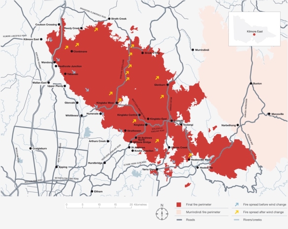
The effect of the windchange on the Kilmore East fore on Black Saturday from the Royal Commission’s report.

If you need to know when a change will occur, you should ask a weather forecaster. Weather systems in Melbourne typically move from west to east, and cold fronts that bring the change certainly match this pattern. While weather forecasters use models of atmospheric dynamics to predict the passage of these cold fronts, most of us don’t have access to the necessary computer power, data and expertise to solve the equations required to analyze these models.

So what should we do if we want to DIY? Thanks to the Australian Bureau of Meteorology (BoM), we can access data for a range of weather stations to the west of Melbourne. These weather stations record the wind direction and temperature, and the BoM displays these data every half hour via their website, and sometimes more frequently. So we can watch the cool change approach.

But can we do more? If we wanted to model the passage of a cold front to predict the timing of a wind change, how might we do that without the aid of numerical weather forecasting?

Let’s overlay a model of a cold front at Aireys Inlet on the map of weather stations. Cold fronts are usually aligned at an approximate 45 degree angle. Imagine it sweeping from west to east. What would be the simplest model for this cold front? Well, we might represent the cold front as a straight line and have it progressing at a constant speed to the east. Let’s assume the cold front is currently at Aireys Inlet (dark line), and we are interested in predicting where it will be at some time in the future (grey line).

Weather Stations to the west of Melbourne, and the modelled cold front moving from west (black) to east (grey).

Weather Stations to the west of Melbourne, and the modelled cold front moving from west (black) to east (grey).

This model has two parameters that we need to estimate. We need to know the slope of the cold front and its speed. Thinking of the model in this way helps us realise how it might be wrong – the cold front might not be a straight line (it might be curved), and it might not move at a constant velocity (it might change speed or direction). For example, a curved front slipping away to the south east might take longer to arrive than anticipated.

Bearing these simplifications in mind, we will plough on with our simple model, and leave more realistic ones to the experts. We can define the model geometrically. Think of the location of Aireys Inlet as being the origin of an x-y graph, so Aireys Inlet has coordinates (0, 0). Melbourne is approximately 76 km east of Aireys Inlet and 72 km north, so Melbourne has coordinates (76, 72). We can define the coordinates of all the other weather stations (and all other locations) in a similar way. A negative value for the x-value of the coordinate indicates that the site is to the west of Aireys Inlet and a negative y-value indicates the site is to the south of Aireys Inlet.

When the front is at Aireys Inlet, the equation defining its location is y = −bx (with b, a positive number, defining the backward slope of the front). If the front is moving eastward at a speed of v km/hour, then after t hours, the front will be vt kilometres to the east. So, the equation defining the location of the front at some other time is y = −b(xvt).

I've switched the model of the cold front onto an X-Y coordinate system. I've chosen the origin to be Airey's Inlet, so all locations are measured relative to there.

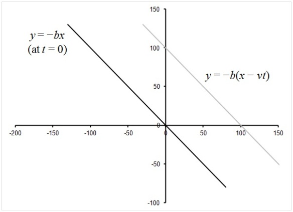
I’ve switched the model of the cold front onto an X-Y coordinate system. I’ve chosen the origin to be Airey’s Inlet, so all locations are measured relative to there.

The location and time in this equation is relative to a reference location; in this case I chose Aireys Inlet. So a negative value for time t indicates the passage of the front at a particular location prior to it arriving at Aireys Inlet.

We can manipulate the equation y = −b(xvt) to determine the time of arrival of the front for any location x and y by solving for t. Thus:

xvt = y / b

vt = y / b x

t = y / bv + x / v

This tells us that the time of arrival of the front at a particular location depends on the coordinates of the location (x, y), and the speed (v) and slope (b) of the front. So to determine the arrival time, we must estimate the two parameters b and v. If the front is at Aireys Inlet, then it will have passed at least some of the other weather stations, so we will know when it arrived at those locations. Therefore, we can fit the observed times and locations of the passage of the front to the equation t = y / bv + x / v to estimate b and v.

A simple way to estimate b and v is to construct the model as a linear regression. Manipulating the equation (by dividing both sides by x), we have:

t/x = y/xbv + 1/v,

in which the variable t/x is proportional to the variable y/x (with a constant of proportionality 1/bv) plus a constant 1/v.

This is simply a linear regression of the form Y = mX + c, based on the transformed variables Y = t/x and X = y/x. The speed and slope of the front are defined by the regression coefficients, and are v = 1/c and b = c/m.

Let’s apply that to some data on the passage of a cold front. Melbournians might remember the front that arrived on 17 January 2014 after a few days with maximums above 40°C. I’m sure tennis players in the Australian Open remember it – seeing Snoopy anyone?

Here are recorded times for the passage of the cold front at weather stations prior to them arriving at Aireys Inlet. The column t is the number of hours relative to arrival at Aireys Inlet. For example, the front arrived at Mount Gellibrand 15 minutes (0.25 hours) prior to its arrival at Aireys Inlet.

Location

x

y

Time

t

y/x

t/x

Port Fairy

−162.77

0.99

10:46

−2.77

−0.00611

0.01700

Warrnambool

−144.09

13.07

11:10

−2.37

−0.09072

0.01643

Hamilton

−182.00

82.39

11:48

−1.73

−0.45269

0.00952

Cape Otway

−48.93

−46.16

12:03

−1.48

0.94350

0.03032

Mortlake

−117.20

38.83

12:09

−1.38

−0.33131

0.01180

Westmere

−104.02

79.46

13:08

−0.40

−0.76391

0.00385

Mount Gellibrand

−27.07

24.66

13:17

−0.25

−0.91092

0.00924

Aireys Inlet

0.00

0.00

13:32

0.00

The linear regression of t/x versus y/x yields m = 0.0133 and c = 0.0171. Therefore, v = 58.5 km/hour and b = 1.28. The value of v means the front was estimated to be moving eastward at 58.5 km/hour, and the value of b implies it was approximately aligned at an angle of tan−1(1.28) = 52° above the horizontal (b = 1 would imply an angle of 45°).

The regression for the cool change on 17 January 2014. Note that the cool front took longer than predicted to reach both Geelong and Melbourne (blue dots; these were not used to construct the regression).

The regression for the cool change on 17 January 2014. Note that the cool front took longer than predicted to reach both Geelong and Melbourne (blue dots; these were not used to construct the regression).

Using those parameters, the time at which the front is expected to arrive at a location with coordinates (x, y) is t = 0.0133y + 0.0171x (relative to the time it arrived at Airey’s Inlet). Different fronts will have different alignments and move at different speeds, so these parameters only apply to the passage of this particular front.

But let’s look at the regression relationship more closely; it has some interesting attributes. Firstly, the relationship is approximately linear, although clearly imperfect. The approximate linearity might encourage us to have some faith in our rather bold assumptions.

Also, one of the points, corresponding to Cape Otway, has a potentially large influence on the regression. Being to the right of the other data, it has “high leverage”; the regression line will tend to always pass quite close to that point.

Whether that high leverage is important will depend on where we wish to make predictions. It turns out that Melbourne is located very close to that point. Now, that might seem surprising at first because, compared to Cape Otway, Melbourne is in the opposite direction from Aireys Inlet. In fact, that is why Cape Otway and Melbourne have similar values for y/x (the “x-value” of the regression model) – the two locations are in opposite directions from Aireys Inlet.

This dependence of the regression on when the front reaches Cape Otway actually means we can very much simplify the model. We can use t/x for Cape Otway to predict t/x for Melbourne because they have very similar values of y/x. For Cape Otway, x = −48.93, and for Melbourne x = 76.14. If the front arrived at Cape Otway (relative to Aireys Inlet) at tCO, then the time it arrives at Melbourne, tM, is predicted from the expected dependence:

tCO / −48.93 = tM / 76.14.

Thus, tM = −tCO 76.14/48.93 = −1.56tCO.

That is, the time it takes for the front to arrive in Melbourne from Aireys Inlet is approximately the time it takes the front to travel between Cape Otway and Aireys Inlet multiplied by 1.56. The accuracy of this method can be assessed by comparing it to data on the passage of two fronts (17 Jan 2014 and 28 Jan 2014).

On 17 January, the front took 1.48 hours to travel between Cape Otway and Aireys Inlet, so our simplified model predicts the front’s arrival in Melbourne 2.3 hours after it passed through Aireys Inlet. The observed time was 3.2 hours, so the front took about 55 minutes longer than predicted. Thus, the data point for Melbourne is above that of Cape Otway.

On 28 January, the front took 1.56 hours to travel between Cape Otway and Aireys Inlet, so our simplified model predicts the front’s arrival in Melbourne 2.1 hours after it passed through Aireys Inlet. The observed time was 1.7 hours, so the front arrived about 25 minutes sooner than predicted. Thus, the data point for Melbourne is below that of Cape Otway.

CoolChange28Jan

The regression for the cool change on 28 January 2014. Note that the cool front arrived than predicted in both Geelong and Melbourne (blue dots; these were not used to construct the regression).

Interestingly, errors in the predictions could have been anticipated once the front arrived in Geelong. Because the front on 17 January took longer than predicted (by the regression) to arrive in Geelong, it seems to have travelled slower than anticipated. In contrast, the front on 28 January arrived in Geelong earlier than predicted, so its passage might have accelerated.

The simplification tM = −1.56tCO only works for predicting arrival of the front at Melbourne. If you want to predict the passage of the front at other locations, you might need to do the linear regression (or better still, ask a numerical weather forecaster).